WordPress block themes – Predefined styles
WordPress block themes have a series of predefined styles. These styles are added by default when creating the different sections of your theme in WordPress. While it might not seem important to know, it’s good to keep in mind that they exist outside of the graphical context we use (GUI – Graphical User Interface).
Blocks
| blocks | class |
|---|---|
| columns | wp-block-columns wp-block-column |
| Headings(h1,h2,h3,h4,h5,h6) | wp-block-heading |
| images | wp-block-image |
| group | wp-block-group |
| spacer | wp-block-spacer |
| Social | wp-block-social-links |
| list | wp-block-list |
| hr | wp-block-separator (must be in hr) |
| Media text Media text | wp-block-media-text |
| Comments | wp-block-comments |
| nav | wp-block-navigation |
| login | wp-block-loginout |
| button | wp-block-buttons wp-block-button |
| Posts | |
| Post-featured-image | wp-block-post-featured-image |
| Post content | wp-block-post-content |
| Post title | wp-block-post-title |
| Post excerpt | wp-block-post-excerpt wp-block-post-excerpt__excerpt(p element) |
| Post autor | wp-block-post-author wp-block-post-author__avatar wp-block-post-author__content wp-block-post-author__name |
| Post autor name | wp-block-post-author-name |
| avatar | wp-block-avatar |
| category | wp-block-post-terms |
| Site | |
| Site logo | wp-block-site-logo |
| Site title | wp-block-site-title |
| Site tagline | wp-block-site-tagline |
typography
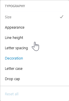
Pre-styles alignment classes
| Aligns | class |
|---|---|
| left | has-text-align-left |
| center | has-text-align-center |
| right | has-text-align-right |
| top | is-vertically-aligned-top |
| Vertical-center | is-vertically-aligned-center |
| bottom | is-vertically-aligned-bottom |
Pre-styles fonts size
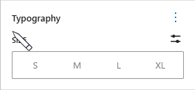
| Font size | class |
|---|---|
| Small | has-small-font-size |
| Medium | has-medium-font-size |
| Large | has-large-font-size |
| X-large | has-x-large-font-size |
Pre-style Colors typography
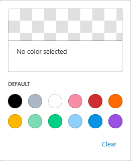
| color | class |
|---|---|
| white | has-white-color |
| black | has-black-color |
| cyan-bluish-gray | Has-cyan-bluish-gray-color |
| Vivid purple | has-vivid-purple-color |
| Vivid red | has-vivid-red-color |
| Luminous vivid orange | has-luminous-vivid-orange-color |
| Luminous vivid amber | has-luminous-vivid-amber-color |
| Light green cyan | has-light-green-cyan-color |
| Vivid green cyan | has-vivid-green-cyan-color |
| Pale cyan blue | has-pale-cyan-blue-color |
| Vivid cyan blue | has-vivid-cyan-blue-color |
| Pale Pink | has-pale-pink-color |
Backgrounds
Pre-Style Colors Background
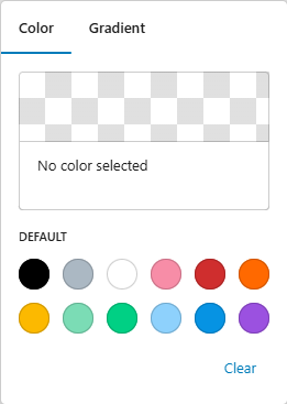
| background | Class name |
|---|---|
| white | has-white-background-color |
| black | has-black-background-color |
| cyan-bluish-gray | has-cyan-bluish-gray-background-color |
| Vivid purple | has-vivid-purple-background-color |
| Vivid red | has-vivid-red-background-color |
| Luminous vivid orange | has-luminous-vivid-orange-background-color |
| Luminous vivid amber | has-luminous-vivid-amber-background-color |
| Light green cyan | has-light-green-cyan-background-color |
| Vivid green cyan | has-vivid-green-cyan-background-color |
| Pale cyan blue | has-pale-cyan-blue-background-color |
| Vivid cyan blue | has-vivid-cyan-blue-background-color |
| Pale Pink | has-pale-pink-background-color |
Shadows
Shadows are a special case. WordPress doesn’t assign a class to them in the traditional sense. Instead, it adds the shadow style inline to the element where we apply the shadow.
| default shadows | style added |
|---|---|
| Natural | box-shadow:var(–wp–preset–shadow–natural) |
| Deep | box-shadow:var(–wp–preset–shadow–deep) |
| Sharp | box-shadow:var(–wp–preset–shadow–sharp |
| Outlined | box-shadow:var(–wp–preset–shadow–outlined) |
| Crisp | box-shadow:var(–wp–preset–shadow–crisp) |
Other possible shadows are the customized ones, but you will have to create them yourself in the shadow creation section.
bordes
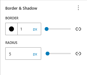
Just like shadows, borders will be added with inline styles. For example, the top border will be added in the following way
style="border-color:#000000;border-width:1px;border-radius:5px"


