Using sprites images in your web
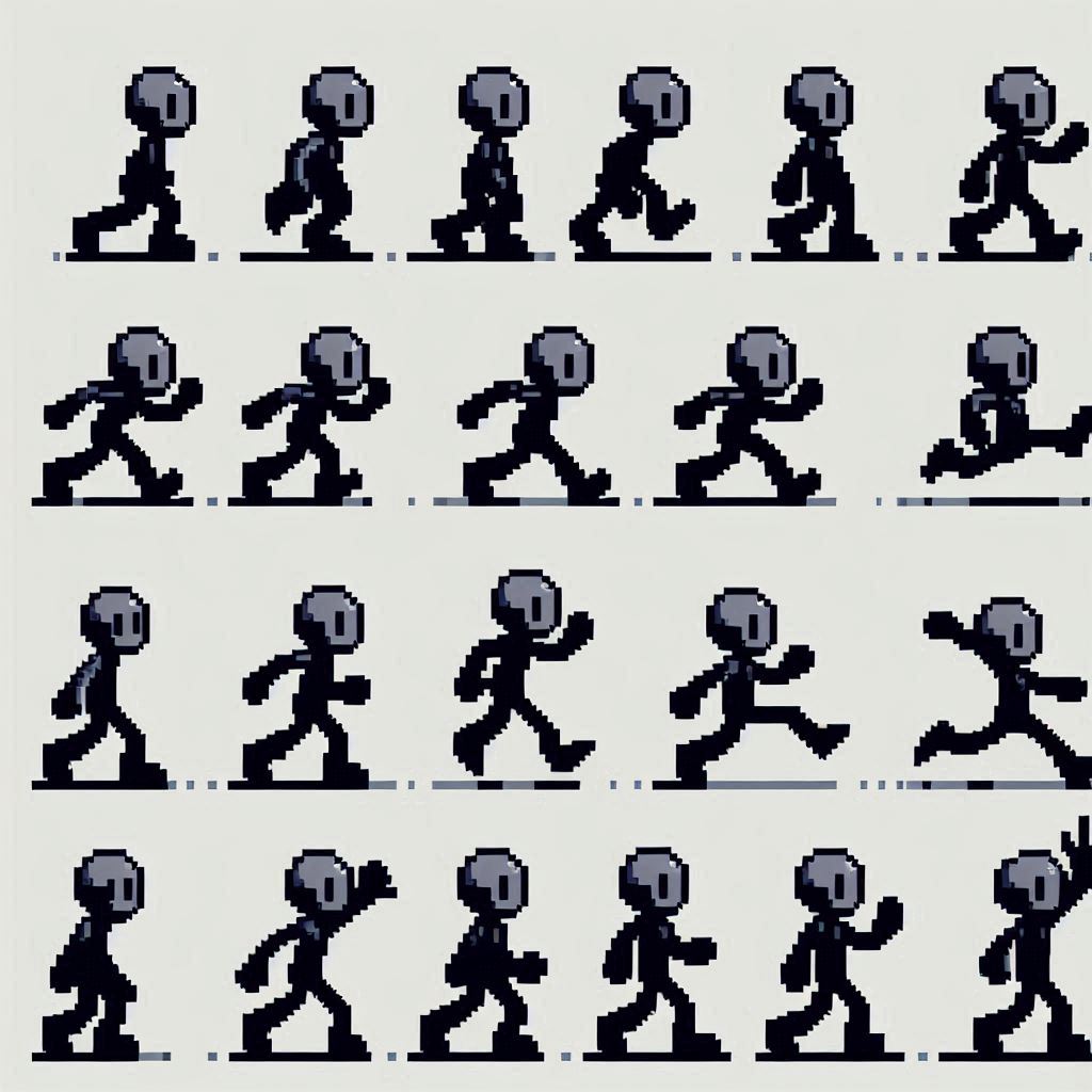
As you might be thinking, ‘What are sprite images on my website?’ Think of an old PC game; it needed several sprites that represented the character’s movement

And maybe you’re wondering, why do I need this?
In the reality of the web, it’s beneficial to have all the sprites in a single image for what will be the buttons. Another question you might be asking is:
‘Isn’t it better to load the images one by one?’ – No. Because it increases requests.
HTTP2 y HTTP1.1
Today we have 2 versions of the HTTP protocol being used on the web: HTTP/1.1 and HTTP/2.
Depending on how your server is configured, that’s the version it will use. Basically, the loading of your files when someone accesses your page happens through this protocol.
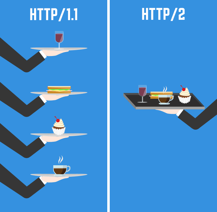
Let’s put it this way, HTTP/2 sends multiple pieces of different files at the same time. You can see something more detailed in HTTP/2 vs HTTP/1.1.

It’s as if you asked a waiter to bring you 8 burgers, and HTTP/1 brings those burgers in 4 rounds, while HTTP/2 does it in 2 rounds.
There is a big difference between both versions; it would be better to use HTTP/2.
Still, you should use sprite images. This will reduce the number of requests on your server.
Let’s make a Sprite image of a web page to learn
The first thing we need to have is a sprite image. In my case, I will do this with an image of 135×45 px that I have prepared. This image consists of the first letters of blastcoding.com

Okay, let’s begin. The first thing is to create our HTML:
<!DOCTYPE html>
<html>
<head>
    <meta charset='utf-8'>
    <meta http-equiv='X-UA-Compatible' content='IE=edge'>
    <title>Page Title</title>
    <meta name='viewport' content='width=device-width, initial-scale=1'>
    <link rel='stylesheet' type='text/css' media='screen' href='style.css'>
</head>
<body>
    <span class="letra letra1"></span>
    <span class="letra letra2"></span>
    <span class="letra letra3"></spans>
</body>
</html>
First, in this case, we should specify the size of our letter. In my case, I set it to 45px in height and 45px in width. I also set it as display: inline-block so that it becomes an inline block. This means I can place this image in a paragraph, for example.
.letra{
    display:inline-block;
    background-image: url("BLA.png");
    background-color: black;
    width:45px;
    height: 45px;
}
Besides specifying the size of the image and the image itself, I have to tell it which section I want to display, right?
Let’s continue by adding CSS code to our style.css:
style.css
.letra.letra1{
    background-position-x: 0px;
}
.letra.letra2{
    background-position-x: 45px;
}
.letra.letra3{
    background-position-x: 90px;
}
Lets check what we get:

But what happened? Shouldn’t we have gotten BLA in our image? Why are both the A and L swapped?
But are we really doing what we wanted?
Let’s look at our BLA image where 0 is in the top left corner of the B square, right? What happens when we set position-x to 45px? We’re telling it to move the image 45 to the right, which shifts all of BLA to the right and makes L appear.
Therefore, what we should do is use negative values instead of positive ones.
¿When to use sprite images in your site?
Imagine the comments section if you are making one. What images do these generally have? Some have forward, reply, upvote, downvote, and if it is your comment, edit if allowed.
In general, this is used in some system that requires images. At the moment, I can’t think of many, but it could be a section where the user edits, for example, the WordPress editor itself as an example
Exercise:
if you’re up for a challenge, you could use the initial image to create some sprite to play with.
On the other hand, if you’re more serious about this, you could use images from Google Icons. In this case, I recommend placing the images in squares first and using the auto-align center of x and y to align them to the squares first, and then use these to create your sprite.


